10. Using Spinners and Pickers
10.1. Create a Spinner
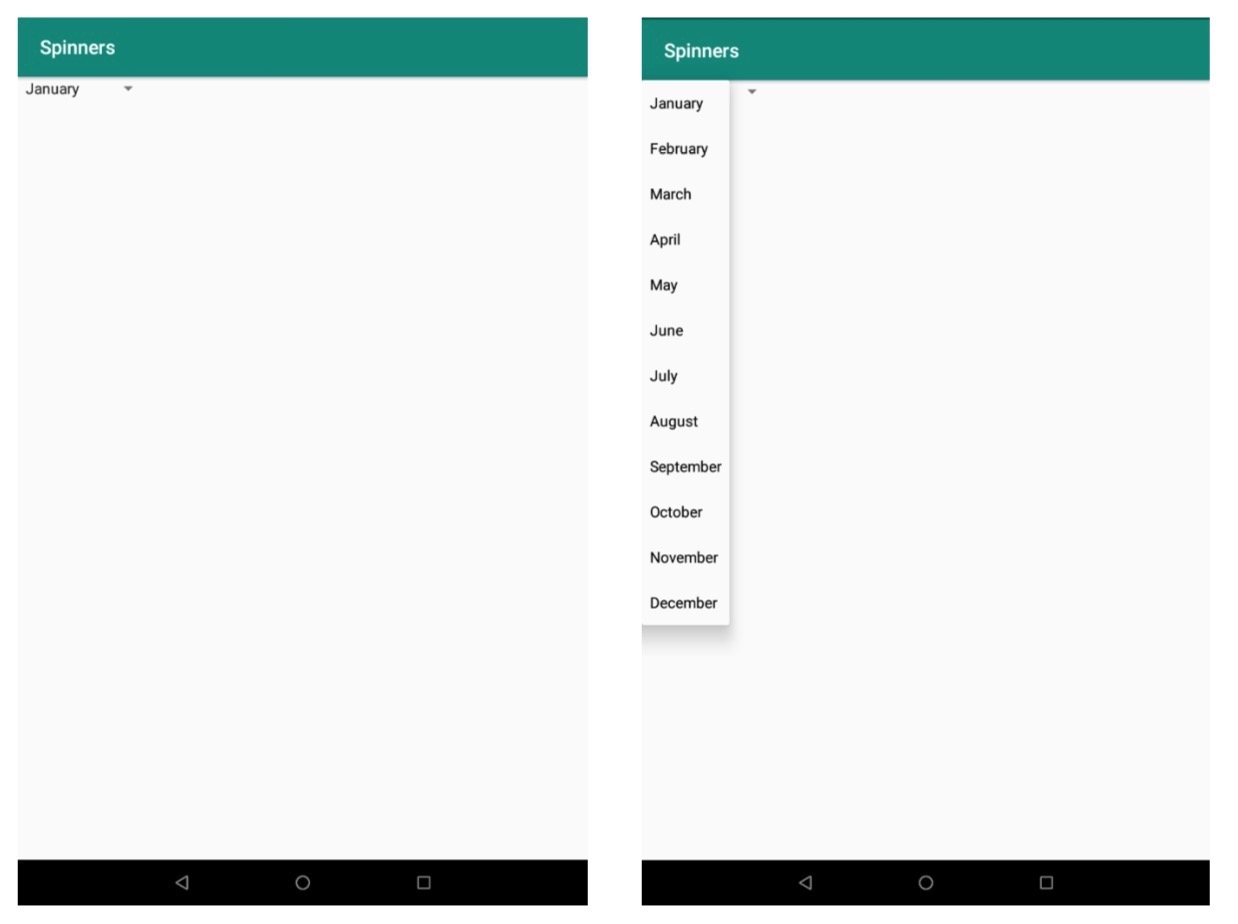
Spinners provide a quick way to select one value from a set. By default, the first element of the specified list is selected in the Spinner. Touching the spinner displays a dropdown menu with all other available values, from which the user can select a new one.
10.1.1. Add a Spinner To Layout
-
Create a new empty project, and remove the Hello World TextView in
activity_main.xml. -
add a spinner to layout by writing the following code to
activity_main.xml:<Spinner android:id="@+id/spinner1" android:layout_height="wrap_content" android:layout_width="wrap_content"/>
10.1.2. Populate Spinner With Choices
-
In order to fill the spinner, if the available choices for your spinner are pre-determined, go to res/values/strings.xml and provide a string array. For example:
<string-array name="months">
  <item>January</item>
  <item>February</item>
  <item>March</item>
  <item>April</item>
  <item>May</item>
  <item>June</item>
  <item>July</item>
  <item>August</item>
  <item>September</item>
  <item>October</item>
  <item>November</item>
  <item>December</item>
</string-array>
10.1.3. Responding to User Selections
-
Now, in
MainActivity.kt, implement the AdapterView.OnItemSelectedListener interface, and supply the spinner with the array using an instance of ArrayAdapter.class MainActivity : AppCompatActivity(), AdapterView.OnItemSelectedListener
When user selects an item from the drop-down, the Spinner object receives an on-item-selected event.
val spinner: Spinner = findViewById(R.id.spinner)
val adapter = ArrayAdapter.createFromResource(
    this,
    R.array.months,
    android.R.layout.simple_spinner_item
)
adapter.setDropDownViewResource(android.R.layout.simple_spinner_dropdown_item)
spinner.setAdapter(adapter)
spinner.setOnItemSelectedListener(this)
The
createFromResource()method allows to create an ArrayAdapter from the string array. Thesimple_spinner_itemlayout is provided by the platform and is the default layout.setDropDownViewResource(int)specifies the layout the adapter should use to display the list of spinner choices.setAdapter()applies the adapter to Spinner. -
The AdapterView.OnItemSelectedListener requires the
onItemSelected()andonNothingSelected()callback methods:override fun onItemSelected(parent: AdapterView<*>, view: View, position: Int, id: Long) { val text = parent.getItemAtPosition(position).toString() Toast.makeText(parent.context, text, Toast.LENGTH_SHORT).show() } override fun onNothingSelected(parent: AdapterView<*>) { }
10.1.4. Run The App
Click Run to install and run the app. It should look like the pictures below on the Lenovo tablet.
10.2. Create a Picker
Android provides controls for the user to pick a time or pick a date as ready-to-use dialogs. Using these pickers helps ensure that your users can pick a time or date that is valid, formatted correctly, and adjusted to the user’s locale.
10.2.1. Creating a Date Picker
-
Create a new empty project, and remove the Hello World TextView in
activity_main.xml. -
Add
buttonto the layout, constraint it to the top of layout with a suitable margin. Then change theidto “dateClick”” andtextto “Pick date”. -
Then add a
TextViewto the layout, constraint it to the bottom of the button with a suitable margin. Then change thetextto Date Picker Dialog. -
Go to
MainActivity.ktand create a function:fun pickDate (view: View){ }
Now, go back to
activity_main.xml, set theonClickattribute of button to pickDate. -
Complete
pickDatefunction.These use the current date as the default date in the picker
val c = Calendar.getInstance()
val year = c.get(Calendar.YEAR)
val month = c.get(Calendar.MONTH)
val day = c.get(Calendar.DAY_OF_MONTH)
Then create a new instance of
DatePickerDialogand show it inTextView. “monthOfYear+1” is required for displaying the date because android starts counting the months from 0.val dpd = DatePickerDialog(this, DatePickerDialog.OnDateSetListener{ view, year, monthOfYear, dayOfMonth -> textView.text = "$year/${monthOfYear+1}/$dayOfMonth" }, year, month, day) dpd.show()
-
Install and run the app, It should look like the pictures below on the Lenovo tablet.

-
The style of the date picker can be changed. For example, if we do:
val dpd = DatePickerDialog(this, android.R.style.Theme_Holo_Dialog, DatePickerDialog.OnDateSetListener
The date picker will look like this instead:
